Why dark fabric changes the print result
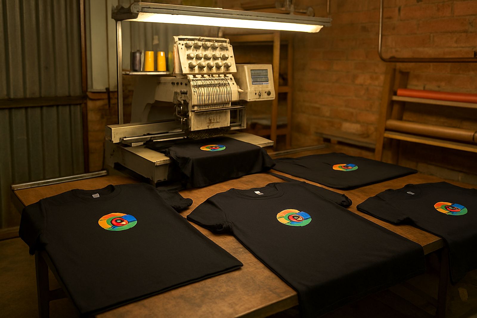
Printing on a black, navy or deep green shirt is not the same as printing on a white one. On a light garment, many inks show their true colour straight away. On dark fabric, the shirt colour can pull the print down and make it look dull, too thin or almost muddy if the method is wrong.
That is why the first question is not just what the logo looks like on paper, but how it will sit on the actual garment. A pale yellow logo on a black shirt may need a stronger print build than the same logo on a white shirt. Even a clean red can shift slightly once it is placed over a dark base, so the final colour must be checked against the cloth, not only a screen image.
For Mbombela businesses ordering corporate wear, this matters on golf shirts, T shirts, staff polos and school event clothing. The garment colour, fabric type and the size of the artwork all play a part.
Choosing the right print method for dark shirts
There is no single method that suits every dark garment. The best option depends on the design, the fabric and the use. Some jobs need a bright solid finish, while others need a softer hand feel or a more detailed image.
- Screen printing works well for solid logos, bold text and bulk orders where the design repeats across many shirts.
- Sublimation printing is best on suitable light polyester items. On dark garments it is not the right choice for clear colour unless the garment is specially prepared.
- Embroidery gives a raised stitched finish and often looks strong on darker shirts for chest logos, caps and workwear.
- Transfer and print techniques can suit smaller runs, finer detail and names, depending on the fabric and the finish required.
For a school, sports team or company in White River or Hazyview, the choice often comes down to quantity and how often the clothing will be washed. A shirt for a once-off function can be treated differently from a staff uniform worn every week.
Underbases: the hidden layer that makes colour show
When printing on dark shirts, an underbase is often the difference between a weak print and a clear one. An underbase is a light layer placed beneath the top colours so the final artwork has something bright to sit on. Without it, lighter inks can disappear into the garment.
This layer is not needed for every job, but when it is used properly it helps the final colour stay visible. White, cream or other light base layers can make yellow, orange, light blue and other pale shades look far cleaner. If the underbase is too heavy, though, the print can feel thick and less comfortable. If it is too thin, the final colour may still look washed out.
Our production team checks each job carefully, because the right balance matters. On dark cotton tees for a company event in Malelane, for example, the print must stay sharp in the sun and still look neat after repeated washing. That is where testing before bulk production saves time and money.
What affects the final colour you see
The printed result is shaped by more than ink alone. The shirt shade, fabric texture, garment finish and artwork file all affect the final colour. A black shirt with a smooth surface will not behave the same as a textured golf shirt or a fleece item. The same logo may also look slightly different on cotton compared with polyester blend fabric.
Artwork preparation matters too. If the original file is low quality, the edges can blur and colours may not separate cleanly. Good digitising or artwork setup helps keep small lettering readable and makes sure the print sits correctly on the garment. When a logo has fine lines, tiny text or a gradient, it may need a careful redraw or a simpler print version.
For a practical result, we usually recommend checking these points before approval:
- Shirt colour and fabric type
- Logo size and placement
- Whether light colours need an underbase
- How the garment will be washed and worn
- How many pieces are needed for the order
Using samples and approvals before the full run
A proper sample or mock-up can prevent costly mistakes. On dark shirts, a logo that looks perfect on screen may still need a darker outline, a stronger base or a different print method. Once the test piece is approved, the rest of the order can move ahead with less risk.
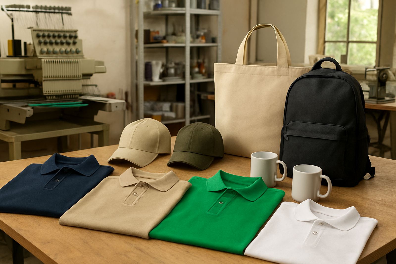
This is especially useful for corporate wear and schoolwear, where consistency matters. If a company in Barberton wants staff shirts, the front logo, back print and sleeve detail should all be checked before the full batch is packed. The same applies to caps, bags and gifts where the material can vary from item to item.
We keep the approval process practical. You should be able to see the placement, size and general look before production continues. That saves rework and helps keep bulk orders on track, even when the order includes mixed sizes and different garment types.
Local examples from the Lowveld
In Mbombela and the wider Lowveld, dark shirts are common for workwear because they hide dirt better and often last well in busy environments. A security team, workshop crew or school events team may all prefer navy or black garments for daily use. But those colours need careful handling if the logo must stay clear and easy to read.
Take a White River lodge ordering dark polo shirts for front-of-house staff. A pale logo on the left chest should stand out without looking harsh. If the design is too faint, guests may not see it from a few metres away. If it is too thick, staff may find it uncomfortable in the heat. In summer, with load-shedding affecting some work schedules and production timing, it helps to approve details early and keep the order simple where possible.
For schools in Hazyview or Kabokweni, dark event shirts often need names, house colours and a clear logo all on one garment. That is manageable, but the layout must be planned so the wording stays readable and the final colour does not get lost against the shirt. Practical choices make the clothing look neater and last better.
How CK Embroideries handles dark-shirt orders
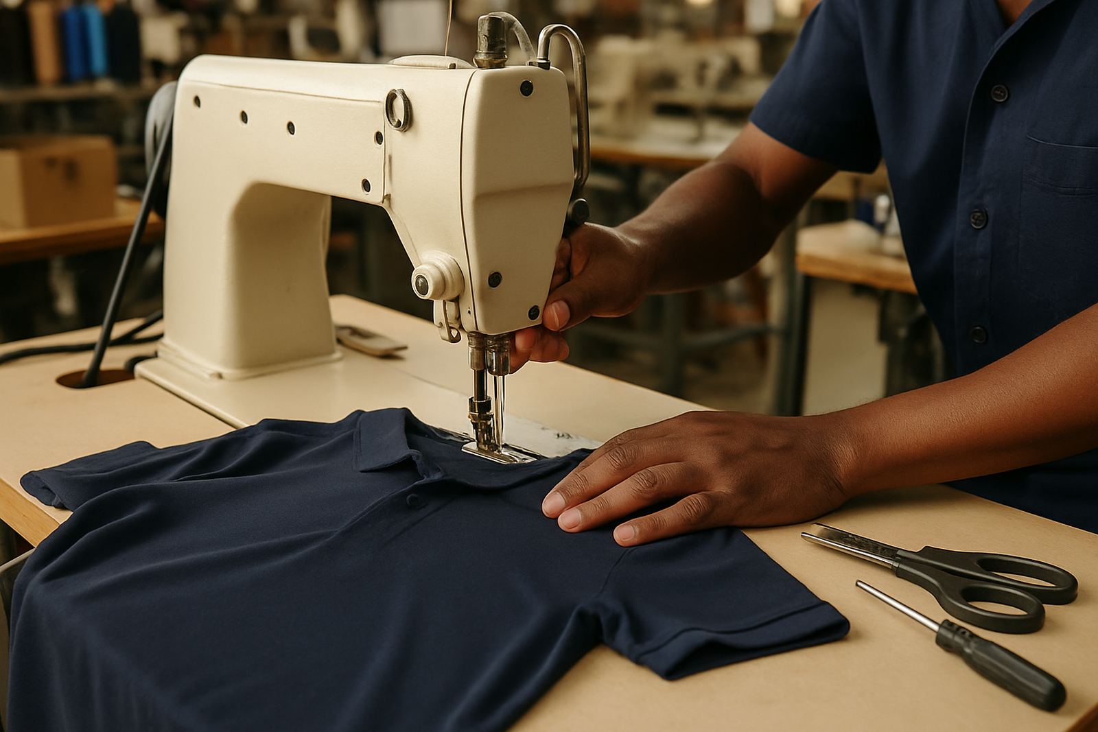
We work from Riverside in Mbombela and supply businesses and schools across the Lowveld, including Nelspruit Central, White River, Hazyview, Malelane, Barberton, Kabokweni and Ngodwana. Our team handles logo digitising, embroidery, screen printing, sublimation printing, cap branding, bag branding, corporate wear supply, schoolwear branding, promotional gifts, name personalisation, mock-ups and approvals, and bulk order packing.
For dark shirts, we look at the garment, artwork and quantity first. Then we advise on the most suitable finish, whether that means embroidery for a cleaner long-wear result or printing for a sharper graphic look. If a stronger underbase is needed, we plan for it. If a simpler design will look better, we will say so. That practical approach keeps the final colour visible and the order aligned to how the clothing will actually be worn.
When you are ordering dark shirts for staff, learners or an event, the safest route is to match the print method to the fabric from the start. It is a small decision, but it can make the difference between a logo that disappears and one that still looks good after many washes.