Why thread colours shift once they go onto fabric
A logo that looks clean on a monitor can change once it is stitched onto a shirt, cap or bag. The base fabric, the thread finish, the stitch density and even the light in a room all affect how a colour appears. A navy logo on white cotton will not read the same way on a black golf shirt or a khaki cap, so the first step is understanding what the garment itself is doing to the colour.
In the Lowveld, bright daylight can make some shades look lighter than expected, while indoor office light can make them look deeper. That is why we do not treat thread matching as a quick guess. We look at the logo, the garment and the end use together so the result makes sense in real life, not just on paper.
- Fabric colour changes how thread is seen.
- Shiny threads reflect light differently from matte thread.
- Small lettering may need a stronger contrast than a large logo.
- Different garments in one order may need slight adjustments.
How we choose the closest thread shade for your logo
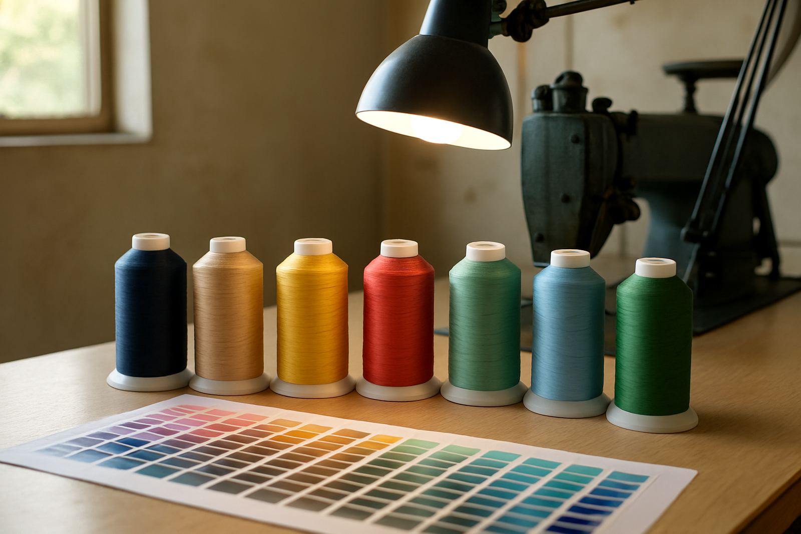
We start with the logo artwork and identify the main colours, then compare those shades against available embroidery thread ranges. If the logo has a very specific corporate colour, we aim for the nearest practical match that will hold up well on the chosen garment. In many cases the best result is not an exact paint chip match, but a thread that reads correctly from normal viewing distance.
For businesses and schools across Mbombela, White River, Hazyview, Malelane and Barberton, this process saves time later because the approval is based on the actual item being branded. If the same logo is going onto caps, overalls and knitwear, we may suggest one thread colour that works across all three, or a small adjustment where the fabric calls for it.
- We check the logo colours against thread options.
- We consider the fabric type and background colour.
- We recommend one match or a small set of matched shades.
- We prepare mock-ups and approvals before production starts.
When exact colour matching is not the best option
Some logos use colours that are hard to reproduce perfectly in thread. Metallic effects, very pale pastels, neon tones and complex gradients are the usual trouble spots. In those cases, chasing an exact visual copy can make the embroidery look weak or muddy once stitched. It is often better to choose a thread shade that stays clear, legible and professional on the garment.
This is especially true for items that get used hard, such as schoolwear, staff shirts and promotional caps. A slightly deeper shade can sometimes give better contrast and better wear, which matters more than a tiny colour difference that only shows up under close inspection. We would rather give you something that holds its shape and reads properly than force a shade that does not suit the process.
- Very light colours may disappear on pale fabric.
- Metallic or neon effects often need a practical substitute.
- Small text needs stronger contrast than large icons.
- Heavy use items should be matched for durability as well as appearance.
Matching thread to shirts, caps, bags and school wear
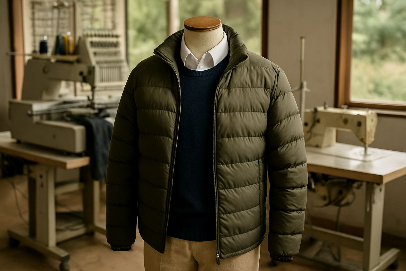
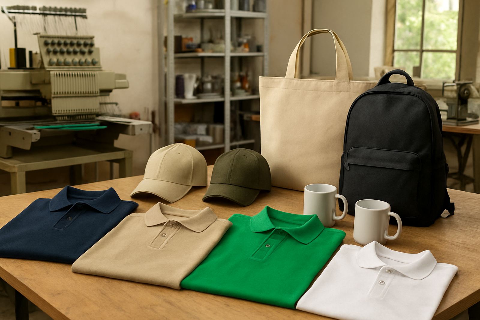
Different items ask for different thread choices. On a structured cap, the stitching sits differently to a soft knit golf shirt. On a bag, the fabric may be thicker and the logo may need a bolder stitch path. School wear often needs clean colour separation so badges, initials and house colours stay easy to read and tidy after repeated washing.
For corporate clothing, we often match thread to existing brand colours on the shirt, tie or trim. For school items, we may work with house colours, crest colours or class identifiers. The same logo can also be adjusted slightly for the item type, because what looks good on a jacket chest may need a stronger line on a cap front. It’s a small detail but it changes the finish a lot.
- Caps need stronger contrast and firm stitch definition.
- Bags often suit bolder thread for better visibility.
- Schoolwear needs colour that survives frequent washing.
- Corporate shirts usually need a cleaner, more formal look.
The role of fabric, lighting and wash care in the final result
Thread colour is only one part of the final result. Cotton, polyester, polycotton and performance fabrics all behave differently under embroidery and printing. A pale grey thread may look crisp on a white golf shirt but flat on a melange garment. Coastal humidity and frequent washing can also change the way colours look over time, so thread selection should take the garment use into account from the start.
Load-shedding and rushed production can tempt buyers to skip approval stages, but that usually creates more delay later. A proper sample or mock-up gives you a chance to check the colour in daylight, at work and on the actual fabric. That small step helps avoid rework, which matters when you are ordering for a team, a class or a full branch rollout.
- Check colour on the actual fabric, not only on a screen.
- Look at the item in daylight and indoor light.
- Plan for washing, wear and local climate.
- Approve the shade before bulk stitching starts.
A Mbombela example: keeping a school and supplier order consistent
We often see this with schools and local businesses in Mbombela and the surrounding areas. A school may need crest embroidery on shirts, PE tops and sports bags, while a supplier may want the same logo on caps, work shirts and courier bags. Each item needs a shade that matches the brand but still suits the fabric. If one item goes too dark, the logo looks heavy. If it goes too light, the details get lost.
In one recent Lowveld order, the client wanted a clean blue logo across white shirts and dark caps for staff who travel between Mbombela, White River and Hazyview. We used one thread family with a slightly adjusted tone for the cap so the logo stayed readable on both garments. The result looked coordinated without forcing one colour into every item, which is usually the smarter way to do it.
What to send us so we can match your thread properly
The more clear information we have, the better the colour match. A logo file, a photo of the garment, and a note about where the items will be worn all help us choose the right thread. If you already have branded clothing or old embroidery to copy, that can help too, especially where the original shade must stay consistent across reorders.
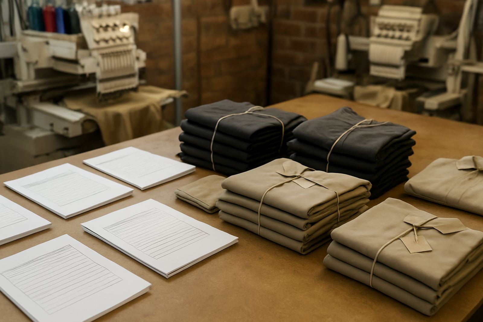
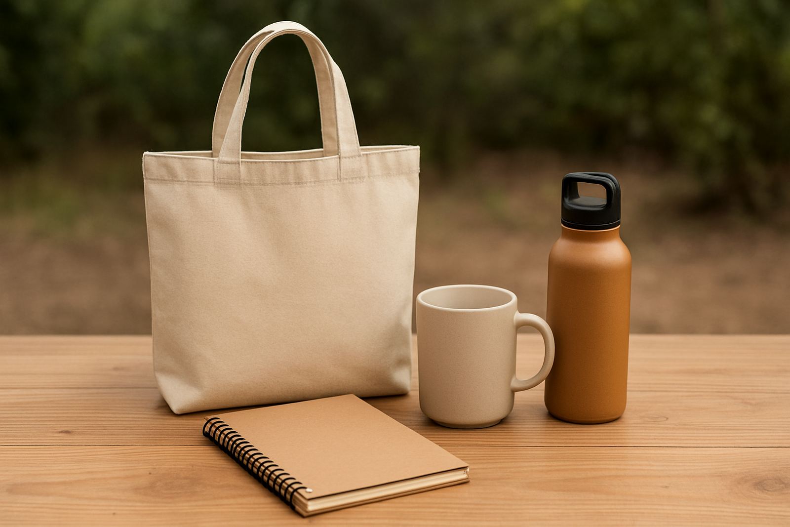
For businesses and schools placing bulk orders, it helps to separate items by colour and size from the start. That keeps the packing clean and makes approvals easier. If you need name personalisation, cap branding or embroidery on a mix of garments and gifts, we can guide the thread choice so the whole order looks like one family of items, not a patchwork of near matches.
- Send the logo artwork in its best available format.
- Share a photo or sample of the garment colour.
- Tell us whether the item is for staff, learners or promotional use.
- Let us know if the order must match existing branded stock.